SwiftUI Multi data-type chart

In iOS 16 Apple introduced Swift Charts, which makes generating beautiful charts both quick and easy. Although creating a line chart in Swift Charts using SwiftUI is not all to difficult, making one with two different data types might be another story. In this article I will go over how to create such a chart.

Introduction
In iOS 16, Apple introduced the Swift Charts. With Swift Charts you can make charts such as Bar-, Line- and point charts. See Apple’s documentation for more information and examples. [https://developer.apple.com/documentation/charts]
In this article we are going to create the following chart in Swift UI.
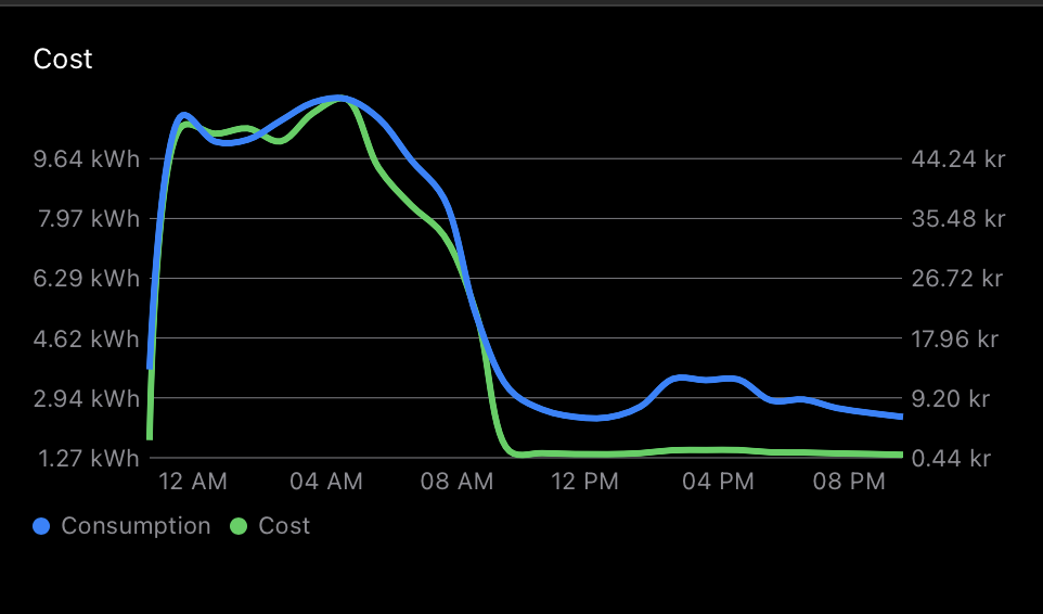
In the image above, you’ll notice that we have a line chart with, on the left hand side, one type of data and, on the right hand side, another. In the case above, the left shows the electricity consumption in Kilowatt hours (kWh) and on the right a total cost for the selected hour. The X axis shows the time of the date for the consumption.
The basics
Lets start with setting up our data first, which we will respresent in SwiftUI. In the example above, we are looking at a 24 hour period of electricity consumption for a home, summarised hour by hour. A similar type of chart you can find in my app Tobbe, where you can login with a Tibber account and show your data.
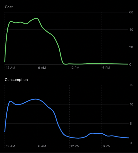
We’ll start off with a basic playground which will show two charts, one for Consumption and one for Cost. These two we are going to merge later in this article. You can check the gist here: https://gist.github.com/ppeelen/46fa0183f71e761df0c416af0cc0b7f7.
Once you have it running, it should look like:
Axis labels
As you might have noticed, the axis information is not good enough. Lets change that first.
Add the modifier for chartXAxis to both Charts:
.chartXAxis {
    AxisMarks(values: .stride(by: .hour, count: 4)) { _ in
        AxisValueLabel(format: .dateTime.hour(.twoDigits(amPM: .abbreviated)))
    }
}
This will add the X axis labels, which in our case are hour labels for every 4th hour of the given dates.
Now we are going to add the Y axis for both charts, but these are different from each other. One thing they will have in comon is the amount of marks each charts has. We want both charts to have the same amount so they will match up later when we are going to merge them.
Add the following line directly after the vstack in the top of the ChartView body, on line 12:
let strideBy = 6And then add this chartYAxis modifier to the cost chart:
.chartYAxis {
    let costs = consumption.map { $0.cost }
    let min = costs.min()!
    let max = costs.max()!
    let costsStride = Array(stride(from: min,
                                   through: max,
                                   by: (max - min)/strideBy))
    AxisMarks(position: .trailing, values: costsStride) { axis in
        let value = costsStride[axis.index]
        AxisValueLabel("\(String(format: "%.2F", value)) kr", centered: false)
    }
}
And this chartYAxis modifier to the consumption chart:
.chartYAxis {
    let consumptions = consumption.map { $0.consumption }
    let min = consumptions.min()!
    let max = consumptions.max()!
    let consumptionStride = Array(stride(from: min,
                                            through: max,
                                            by: (max - min)/strideBy))
    AxisMarks(position: .trailing, values: consumptionStride) { axis in
        let value = consumptionStride[axis.index]
        AxisValueLabel("\(String(format: "%.2F", value)) kWh", centered: false)
    }
}
What these will do is add the Y labels to the right side of the chart (trailing) and calculate each of them to their own respecive value by taking the max and min values into account.
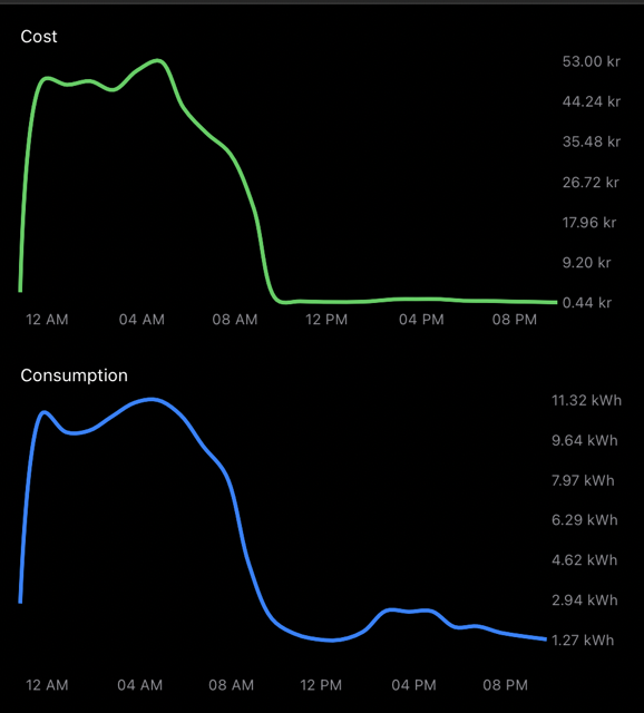
Now your chart should look like:
Merging the two
Now that we have two charts we know what data we want to show and how each of them should look. Now lets make one chart of them. We can merge them by moving the second LineMark for the consumption chart, inside the cost chart directly after the first line mark. So go ahead and move that one for now.
When you have move it, you need to let the chart know that these are two different data sets. You can do this by adding the following modifier to the first LineMark:
.foregroundStyle(by: .value("Value", "Cost"))and this modifier to the consumption LineMark:
.foregroundStyle(by: .value("Value", "Consumption"))Now we need move in the labels for the Y axis too, but we also need to modify them a little. Instead of moving the Y axis labels we’ve created, lets add these instead to the already existing chartYAxis modifier for the Costs chart:
    let consumptions = consumption.map { $0.consumption }
    let consumptionsMin = consumptions.min()!
    let consumptionsMax = consumptions.max()!
    let consumptionStride = Array(stride(from: consumptionsMin,
                                            through: consumptionsMax,
                                            by: (consumptionsMax - consumptionsMin)/strideBy))
    AxisMarks(position: .leading, values: consumptionStride) { axis in
        let value = consumptionStride[axis.index]
        AxisValueLabel("\(String(format: "%.2F", value)) kWh", centered: false)
    }
Now, we can remove the second chart so we only have one chart left. Your body for ChartView should now look like this:
VStack(alignment: .leading) {
    let strideBy: Double = 6

    Text("Cost")
        .font(.footnote)
    Chart(consumption) { item in
        LineMark(
            x: .value("Hour", item.from),
            y: .value("Price", item.cost)
        )
        .interpolationMethod(.catmullRom)
        .foregroundStyle(.green)
        .lineStyle(StrokeStyle(lineWidth: 3))
        .foregroundStyle(by: .value("Value", "Cost"))

        LineMark(
            x: .value("Hour", item.from),
            y: .value("Consumption", item.consumption)
        )
        .interpolationMethod(.catmullRom)
        .foregroundStyle(.blue)
        .lineStyle(StrokeStyle(lineWidth: 3))
        .foregroundStyle(by: .value("Value", "Consumption"))
    }
    .chartXAxis {
        AxisMarks(values: .stride(by: .hour, count: 4)) { _ in
            AxisValueLabel(format: .dateTime.hour(.twoDigits(amPM: .abbreviated)))
        }
    }
    .chartYAxis {
        let costs = consumption.map { $0.cost }
        let min = costs.min()!
        let max = costs.max()!
        let costsStride = Array(stride(from: min,
                                                through: max,
                                                by: (max - min)/strideBy))
        AxisMarks(position: .trailing, values: costsStride) { axis in
            AxisGridLine()
            let value = costsStride[axis.index]
            AxisValueLabel("\(String(format: "%.2F", value)) kr", centered: false)
        }

        let consumptions = consumption.map { $0.consumption }
        let consumptionsMin = consumptions.min()!
        let consumptionsMax = consumptions.max()!
        let consumptionStride = Array(stride(from: consumptionsMin,
                                                through: consumptionsMax,
                                                by: (consumptionsMax - consumptionsMin)/strideBy))
        AxisMarks(position: .leading, values: consumptionStride) { axis in
            AxisGridLine()
            let value = consumptionStride[axis.index]
            AxisValueLabel("\(String(format: "%.2F", value)) kWh", centered: false)
        }
    }
    .padding(.bottom, 20)
}
Last, but not least… lets decrease the height for MainView to 250 from 500.
.frame(minWidth: 450, minHeight: 250)Now if you run the code, the result should look like this:
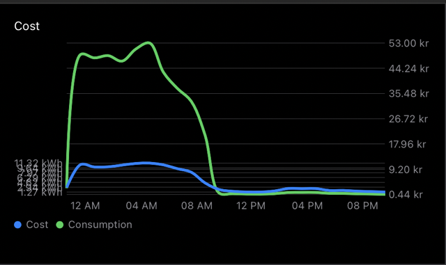
but wait… this looks messed up! I’ll tell you why:
Fixing the messed up chart
The reason things look messed up now is because the chart’s max value is now at ~53, which is the highest value of the cost per hour. However, the kWh consumption never gets this high. The Chart doesn’t understand that these are two different types of data, it is only concerned about the value… so we can’t use these values. There is a way to solve this though.
Since both the left hand side and the right hand side need to have the same types of values, we could calculate the values to percentage of their respective max values, since that could be the common dinominator here.
Add the following directly after the strideBy towards the top of ChartView:
let costs = consumption.map { $0.cost }
let costMin = costs.min()!
let costMax = costs.max()!

let consumptions = consumption.map { $0.consumption }
let consumptionMin = consumptions.min()!
let consumptionMax = consumptions.max()!
This is merly getting the highest and lowest cost values and highest and lowest consumption values.
Now change the value of Price in the first LineMark to:
.value("Price", item.cost / costMax)and change the value of Consumption in the second LineMark to:
.value("Consumption", item.consumption / consumptionMax)Now we need to update the Y axis, since the values won’t match up. You can replace the chartYAxis with the following code:
.chartYAxis {
    let defaultStride = Array(stride(from: 0, to: 1, by: 1.0/strideBy))
    let costsStride = Array(stride(from: costMin,
                                    through: costMax,
                                    by: (costMax - costMin)/strideBy))
    AxisMarks(position: .trailing, values: defaultStride) { axis in
        AxisGridLine()
        let value = costsStride[axis.index]
        AxisValueLabel("\(String(format: "%.2F", value)) kr", centered: false)
    }

    let consumptionStride = Array(stride(from: consumptionMin,
                                            through: consumptionMax,
                                            by: (consumptionMax - consumptionMin)/strideBy))
    AxisMarks(position: .leading, values: defaultStride) { axis in
        AxisGridLine()
        let value = consumptionStride[axis.index]
        AxisValueLabel("\(String(format: "%.2F", value)) kWh", centered: false)
    }
}
So, what are we doing above?
We start off by adding a default stride, one that works for both LineMarks, which goes from 0 to 1 and is offset by the amount of marks we want to make. We use this defaultStride for both Y axis (left and right).
When we create each Y axis marks, we then calculate the value of each mark by using the costsStride and consumptionStride and add our own custom label instead. Now, lets re-run the code and see the result:
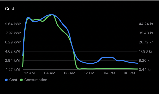
As you can see, both LineMarks use the full size of the chart, but each side has their own value.
Now, the only thing left to do is adding the scales in the correct order. Right now they show Cost and Consumption, but they should be the other way around. You can add the following modifier to the Chart to change the order:
.chartForegroundStyleScale([
    "Consumption": .blue,
    "Cost": .green,
])
This is the final result:

Here is the final code for you to try out in a playground: